The challenge.
Due to Stoford’s success and subsequent growth, the business had outgrown their existing offices which they also felt no longer reflected the value of their brand proposition.
The opportunity.
To invest in an office relocation providing the extra space they needed whilst allowing them to reimagine the way they worked and expressed themselves to their staff, clients and visitors alike. Simultaneously raising the value of their proposition, increasing wellbeing and productivity, giving them superior surroundings, allowing them to project confidence, professionalism and continue to grow and develop their portfolio and wider business objectives.
The solution.
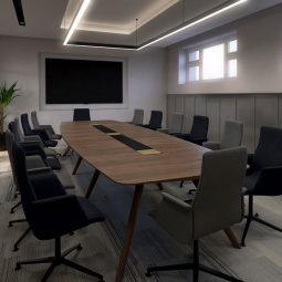
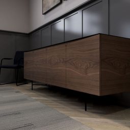
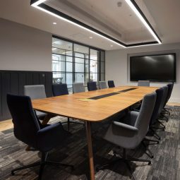
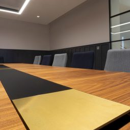
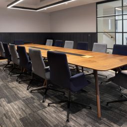
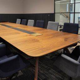
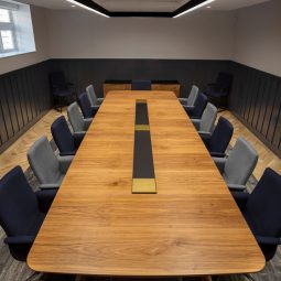
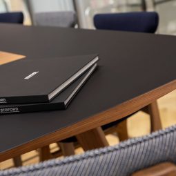
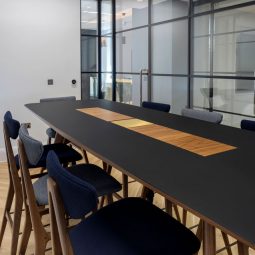
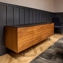
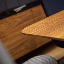
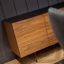
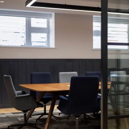
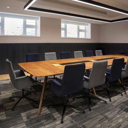
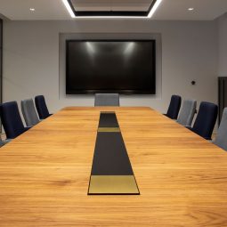
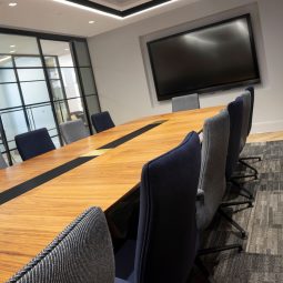
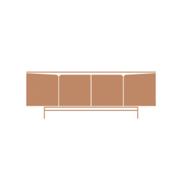
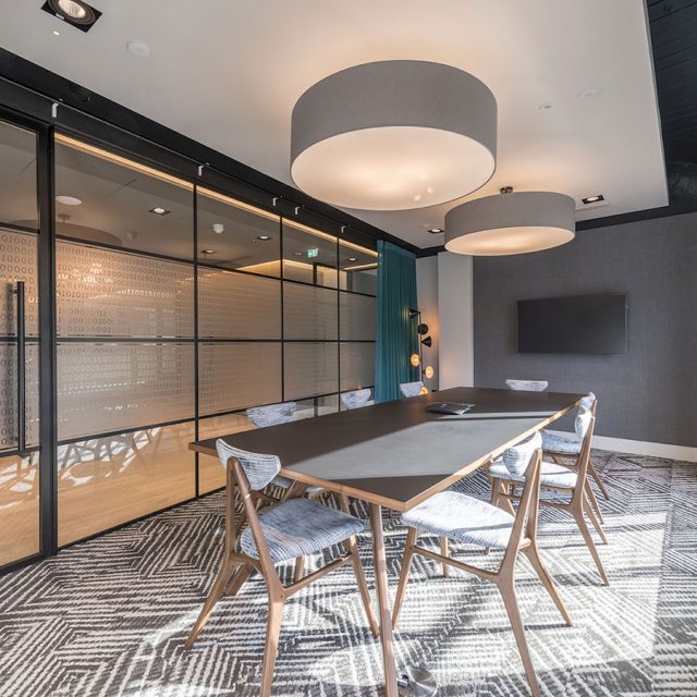
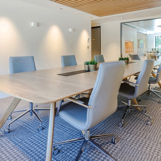
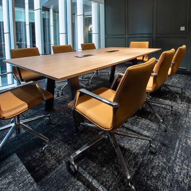
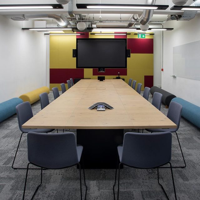
After a detailed consultation with the senior client team and their partner architect in our London Studio we developed a concept to present. Their vision was to create a classically styled, sophisticated, meeting suite but with a contemporary twist. Using a classic finishes pallet of walnut and black we provided a product solution using our Vantage tables, co-working benches and storage. To sit, Cypher conference chairs and Ad poseur chairs.
Using a “random” veneer pattern to wrap the main pieces we were able to soften the look of the conference space creating a calming, residential appeal. The use of different fabrics for the seating also breaks up the uniformity of a single chair colour. The rich and warm tones were punctuated by the use of solid brass lids for the concealed IT connections along with a matt black glass and metal frames.
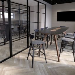
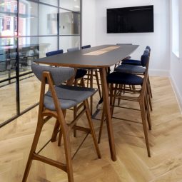
To provide a contrast to the conference space and offer a different meeting dynamic, we suggested a higher table in the accompanying space. We also provided a change in material to a black Fenix Nano-Tech surface. The poseur height Ad chairs complement this, perfectly allowing users to sit comfortably for both short and longer meetings.
The feedback.
The client has expressed how happy they are with the solution. To their delight both staff and visitors alike have commented on how striking the space is and how much they like meeting around the high bench in particular, as it is a different experience to what they have been used too.
We are incredibly proud of the results and would like to congratulate both the client and the architect on a wonderful scheme delivery. We wish them both the continued success this kind of smart investment will ensure!
“Stoford sees our William Hands furniture as a key reflection of the buildings we create – modern, high end and bespoke; designed to fulfill forward-thinking, modern business needs in both relaxed and more formal styles.
Our Edwardian HQ office building was fully refurbished to create a modern, contemporary look, but still in keeping with the building’s classic facade. We wanted to fuse the building’s character and fit-out by choosing quintessential pieces, designed with a modern twist. William Hands created sophisticated key pieces befitting a boardroom atmosphere, and more casual, collaborative items in our second meeting room to create a more relaxed way of meeting, reflecting a more modern approach to collaborative working practices. This included a poseur table and stools, blending beautiful traditional walnut with modern Fenix.”
Clare Birdsell
Stoford
